A modern Design System needs to be scalable, understandable, and modular. Design tokens play a key role by allowing the centralized definition of values and patterns that can be reused across multiple contexts and platforms. In this article, we will explore a detailed approach to structuring design tokens by observing a system that follows a clear and defined hierarchy.
Understanding the Structure of Design Tokens
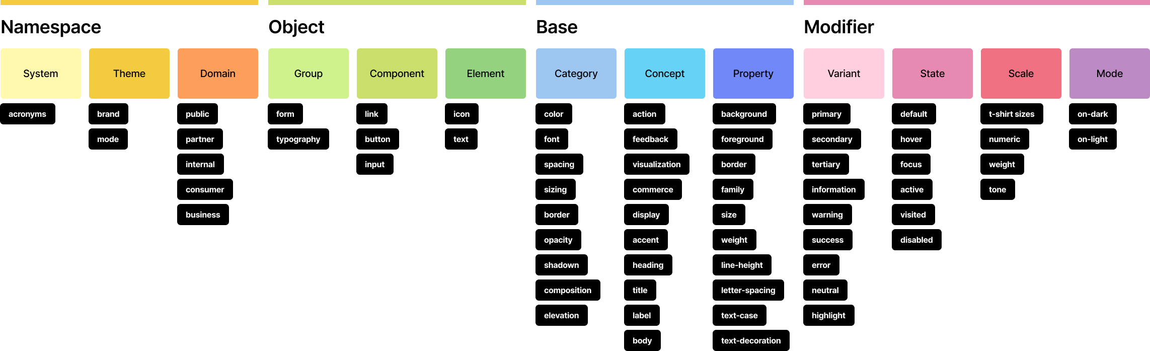
To structure an efficient design token system, it is useful to break tokens down into different layers of abstraction. This allows greater clarity when naming and managing styles across different components and systems. Below, we break down the structure based on the hierarchy shown in the main image, where tokens are divided into four major groups: Namespace, Object, Base, and Modifier.
Namespace: The Starting Point of the Structure
The namespace is the first layer of a design token system. Its function is to encapsulate a set of tokens under the same space, providing a clear organizational framework. In the image, three main categories are shown within Namespace:
- System: Here we find the prefix used as an acronym to identify the system “nds” (Name of the Design System).
- Theme: This focuses on design customization, allowing for theme switching. Examples of subcategories are brand (for brand-related tokens) and mode (for modes such as dark or light).
- Domain: A category aimed at dividing tokens by user type or domain, such as public, partner, consumer, internal, or business.
Each of these subcategories allows the same token system to be applied across different contexts or products without losing consistency.
Object: Defining System Elements
The next level is Object, which allows tokens to be grouped according to the type of object they affect. The main categories of this section include:
- Group: Covering generic groupings such as form or typography.
- Component: Specific elements like buttons (button) or links (link).
- Element: The smaller parts as icon or text children of the components
This organization ensures that tokens can be applied to any element of the design system in a clear and understandable way, from a complete component to a small icon or block of text.
Base: Defining Key Properties
The Base layer defines the fundamental properties that tokens control. Here, we find categories such as:
- Category: Grouping properties like color, font, spacing, sizing, border, opacity, shadow, among others.
- Concept: Referring to more abstract interaction concepts such as
action,feedback, visualization, or display. - Property: Specifies which property of the element or component the token is affecting. For instance, properties like background, foreground, border, family, size, weight, line-height, letter-spacing, text-case, and text-decoration are examples of how specific aspects of an element’s design can be fine-tuned.
This combination of Category, Concept, and Property within the Base layer provides a powerful way to describe what visual or behavioral aspects the tokens control, from basic visual properties like color and spacing to abstract concepts like action or feedback.
Modifier: Customizing Variations and States
Finally, we have the Modifier layer, which allows specifying variations, states, and modes for components. The main subcategories are:
- Variant: Tokens that control variations such as primary, secondary, tertiary, and other types like information, warning, error, and success.
- State: Describes interactive states like default, hover, focus, active, visited, or disabled.
- Scale: Includes adjustments for size and weight such as t-shirt sizes (lg,md,sm), numerical scales (1,2,3), weight (light,regular,bold), or tone (dark,medium,light).
- Mode: Tokens that define different display modes, such as on-dark or on-light.
This level allows flexibility for quickly applying modifications to components in different states or contexts, such as when a button transitions from its default state to a hover or focus state.
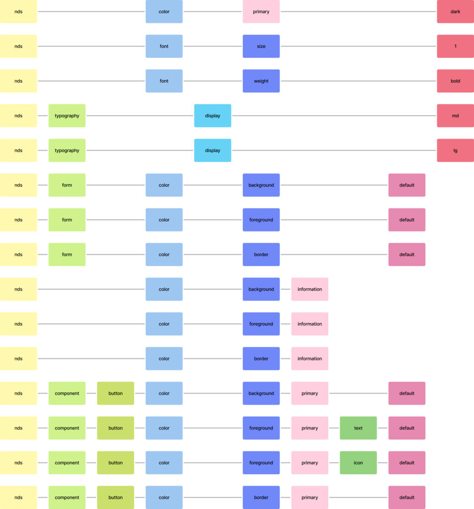
Practical Examples of Applied Design Tokens
In the second image we see examples of how these categories are applied to create specific token names that are functional and clear. Through the composition of different hierarchical levels, tokens are able to precisely describe aspects of any design element.
Example 1: nds-typography-display-lg
This token describes a specific font style (size) to be used in the display typography. It is designed for application to text. Let’s break it down:
- nds: Indicates the namespace, in this case, “Name of the Design System”
- typography: The object that this token affects, in this case, typography.
- display: Describes the purpose or concept for this token, referring to display text.
- lg: A scale modifier specifying that this is large-sized text.
Example 2: nds-component-button-color-background-primary-default
Another real-world token example shows how to describe the background color of a primary button in its default state:
- nds: Indicates the namespace, in this case, “Name of the Design System”
- component-button: The object it affects, in this case, a button component.
- color-background: The property it describes, which is the background color.
- primary: The button is of the primary variant.
- default: The state modifier indicating that this is the default state for the button.
Conclusion: The Importance of Organization in Design Tokens
By structuring a design token system in this way, you get a scalable, reusable, and easy-to-understand system, which is crucial for maintaining a consistent design system over time. The provided examples demonstrate how a clear hierarchy allows tokens to precisely describe all visual aspects of a system, from colors and fonts to states and modes.
This approach also facilitates collaboration between design and development teams, as everyone works under a common and understandable language, ensuring consistency across the digital ecosystem.