In user interface (UI) design, certain visual elements play a crucial role in the overall user experience. Among them, badges, ribbons, and notifications stand out as versatile components that effectively communicate key information in a clear and direct manner. But how do you know when it’s appropriate to use them, and how can you maximize their potential?
In this article, we’ll explore when and how to use these three elements within a design system and share the best and worst practices for using icons in each of them.
Badge
What is a Badge and When to Use It?
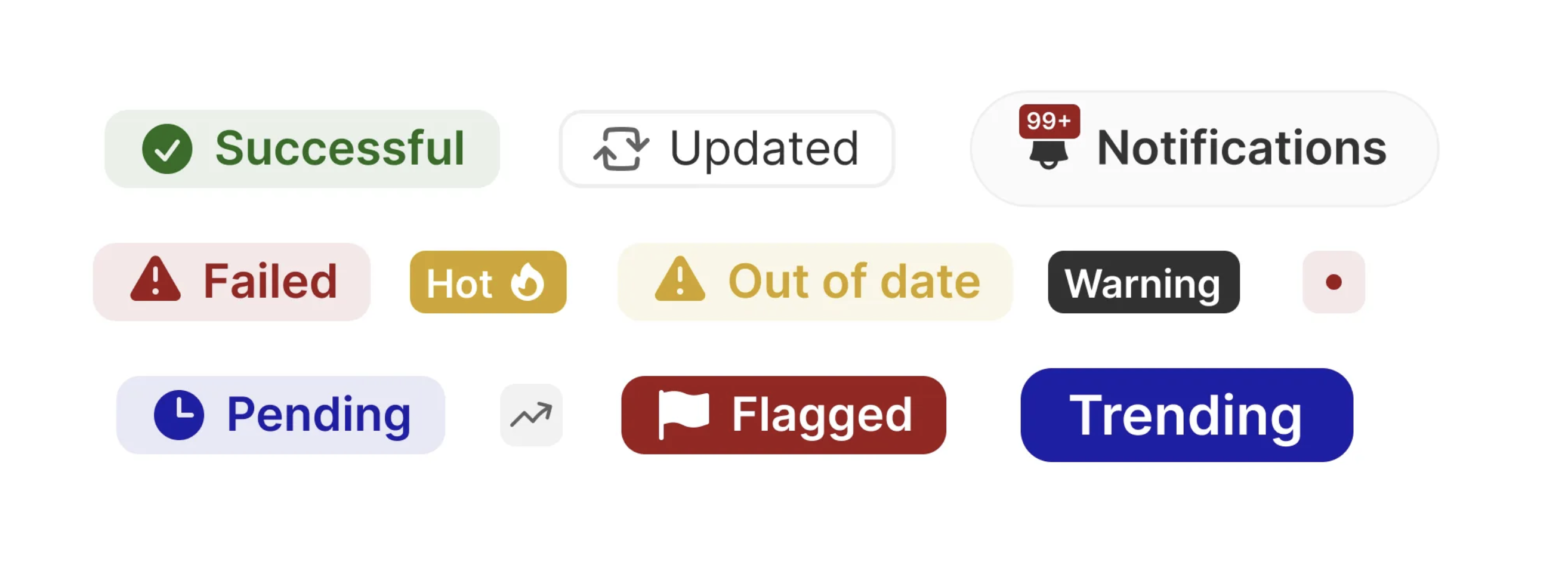
A badge is a small visual element that typically appears on or near a component, such as an icon or product card, to display relevant information like a count or status. Its main function is to highlight concise information that requires immediate attention without disrupting the interface’s flow.
When to use it:
- Notification or count alerts: Use badges to show the number of pending items or actions, such as unread messages, items in a shopping cart, or available updates.
- Status indicators: To signal a relevant state or category, such as the priority of a support ticket or product availability (e.g., “In stock” or “Out of stock”).
Examples:
- A bell icon with a badge showing the number of new notifications.
- A red badge with a number on an inbox icon indicating unread messages.
Best Practices for Icons in Badges:
- Clear visuals: Use simple and recognizable icons that immediately convey the action or status. For example, an envelope for unread emails or an alert symbol for warnings.
- Proper sizing: Ensure the icon is large enough to be visible in the badge’s small space, but not too large to overwhelm it.
- Effective contrast: Make sure the icon contrasts well with the badge’s background so that the information is legible.
Worst Practices:
- Overloading the space: Avoid combining text, icons, and numbers all at once in a small badge. Keep the design simple and focused.
- Ambiguous icons: Don’t use icons that require interpretation or that aren’t universally understood. A confusing icon will frustrate the user and defeat the badge’s purpose.
Ribbon
What is a Ribbon and When to Use It?
A ribbon is a banner or strip that overlays content, such as an image or product card, to highlight a special feature or promotion. Its goal is to catch the user’s attention on something important, like an offer or a new product.
When to use it:
- Highlight promotions or special attributes: Use ribbons when a product or content needs to be emphasized with labels like “On Sale,” “New,” “Exclusive,” or “Limited.”
- For featured products: Emphasize the most popular products, temporary promotions, or new releases.
Examples:
- A ribbon that says “New” on the corner of a product card.
- A banner highlighting a discount offer over a product image in an online store.
Best Practices for Icons in Ribbons:
- Complement the text: Icons in ribbons should reinforce the message. For example, a star icon could accompany a ribbon that highlights a “Featured Product.”
- Simplicity: Since the ribbon already draws attention, the icon should be subtle and not steal focus from the primary content.
- Visual consistency: Ensure the icon’s style matches the rest of the design system to maintain visual coherence.
Worst Practices:
- Redundant icons: Don’t add icons that merely repeat what the text already conveys. If the ribbon says “New,” adding an icon might be unnecessary.
- Overloading with icons: Avoid using large or detailed icons that can make the ribbon look cluttered or unclear.
Notifications
What is a Notification and When to Use It?
A notification is a pop-up or persistent message in the interface that informs the user about important events or required actions. Notifications can be interactive (allowing the user to close or respond) or passive (informative, with no action required).
When to use it:
- To inform about important changes: Notifications are useful when you need to alert the user about system changes, such as a new update, message, or completed event.
- To request user actions: Use notifications when the system requires the user to take a specific action, like confirming a purchase, reviewing a message, or accepting a condition.
Examples:
- A banner at the top notifying the user of a successful update.
- A pop-up notification reminding the user of a pending task.
Best Practices for Icons in Notifications:
- Clear, informative icons: Use icons that help users quickly identify the type of notification. A checkmark icon can indicate success, an exclamation mark a warning, and an “X” an error.
- Visual hierarchy: Icons shouldn’t compete with the main content of the notification. Keep the icon size proportional and aligned with the content.
- Appropriate colors: Ensure the icon’s color matches the notification’s context. Green icons should indicate success, yellow should indicate warnings, and red should indicate errors or issues.
Worst Practices:
- Overloading with icons: Don’t add unnecessary or decorative icons to a notification that already contains sufficient informative text. This can overwhelm the user visually.
- Inconsistent icon colors: Avoid using incorrect icon colors that don’t align with the notification type. A red icon for a success message can confuse users.
Conclusion: When and How to Use These Elements
- Badges are ideal for displaying concise, direct information, such as counts or statuses. Use them when you need to highlight numbers or updates without interrupting the user experience.
- Ribbons are effective for drawing attention to featured products or characteristics. They are visually appealing and should be used sparingly to avoid cluttering the interface.
- Notifications should be used when the user needs to be informed or alerted about important events. Make sure they are clear and non-intrusive, respecting the user experience.
In all cases, the effective use of icons is crucial. Icons should complement rather than overload, and always be accessible and understandable. By following these practices, you can ensure that these components function effectively within a design system, providing an intuitive and pleasant user experience.
If you’re developing a UI design system, remember that balancing functionality and aesthetics is essential. Well-implemented badges, ribbons, and notifications, along with the appropriate use of icons, can make an interface not only visually appealing but also highly functional and accessible.