It is very often that the case of appreciating a good design would be based on intuition in the design world but it is sometimes difficult to explain clearly why a product stands out from the others. What would be the main aspect that makes a product the best option for its audience to choose it? Is it, after all, the simplicity, the structure, or the functionality? The answer depends on what product we’re talking about, though. This article seeks to define the critical elements of a good interaction —ease of use, equity, delight, and usefulness— which are the standards by which a design can be evaluated.
Ease of Use

If a product is easy to use, it means the design, structure, and purpose of the product are clear and the product is easy to understand. When evaluating how easy a product is to use, you can ask yourself questions like: Are all parts of the design easy to find? Is the functionality of the design easy to grasp? Can users accomplish specific tasks within the design? During your evaluation, these questions can help determine if the design is easy to use.
Imagine you’re evaluating how easy to use an airline app is. If the primary goal of this app is to book a flight, the design should provide a clear, simple way to accomplish that task. For example, a section where the user can easily enter itinerary and flight details on the homepage would be an example of ease of use.
Equity

If a product exhibits equity, it means its design is usable for people with diverse abilities and backgrounds. In other words, the product design caters to the needs of a diverse audience and ensures a high-quality experience for all users, regardless of their origin, gender, race, or ability level. Equity is about providing people with the tools they need to achieve their goals and have a better quality of life. Equity goes beyond just equality —giving everyone the same resources— because often people need different tools and support based on their needs. This is especially important for those who belong to groups that are typically excluded. When evaluating the equity of a product’s UX, you might ask yourself questions like: Are the needs of a diverse group of users accounted for? Does the product design address the needs of traditionally underrepresented and excluded groups? These questions can help you determine if the design offers an equitable experience.
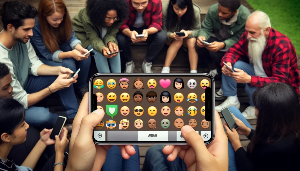
Imagine you’re evaluating how equitable a social messaging app is. You might consider that the design is more equitable if the emoji keyboard offers avatar options with different skin tones and gender-neutral choices.
Delight

If a product provides delight, it means the design delights the user. The design reflects what the user thinks or feels and creates a positive connection with them. A product’s design doesn’t have to be delightful in order to function properly. However, a delightful design complements an already functional product and can enhance the user’s feeling about the experience. When evaluating how delightful a product’s UX is, you might ask yourself questions like: Are there aspects of the design that account for the user’s feelings? Does the design delight the user? Does the design keep the user engaged throughout their experience? These questions can help determine if the design offers a delightful experience.
Imagine you’re evaluating how delightful a video streaming app is. Some design aspects that could make the product more delightful are personalized recommendations based on channels the user previously watched or the ability to customize the look of their account.
Usefulness

If a product is useful, it means it solves the user’s problems. In other words, the design intentionally solves a user problem that the designer has identified. It’s important to note that while related, the concepts of “useful” and “easy to use” have different meanings. A useful product isn’t always easy to use, and vice versa. The distinction is that “easy to use” refers to whether the product functions well and is straightforward to use, while “useful” specifically refers to the ability to solve user problems. When evaluating how useful a product’s UX is, you might ask yourself questions like: Does the design add value to the user’s experience? Does the design solve a problem for the user? Does the design help the user achieve a specific goal? These questions can help determine if the design offers a useful experience.
Imagine you have to evaluate how useful a banking app is. Users typically download these apps because they need a place to manage their money. With that in mind, some aspects of the app that could be considered useful are features that can be used to transfer money between accounts and pay bills.
