In the web development, responsive design is key to ensuring an excellent user experience across different devices and screen sizes. Breakpoints are defined points based on screen width that allow the design to adjust for different device sizes. Choosing the right breakpoints is essential for building an efficient and visually consistent website.
Common breakpoints and configurations
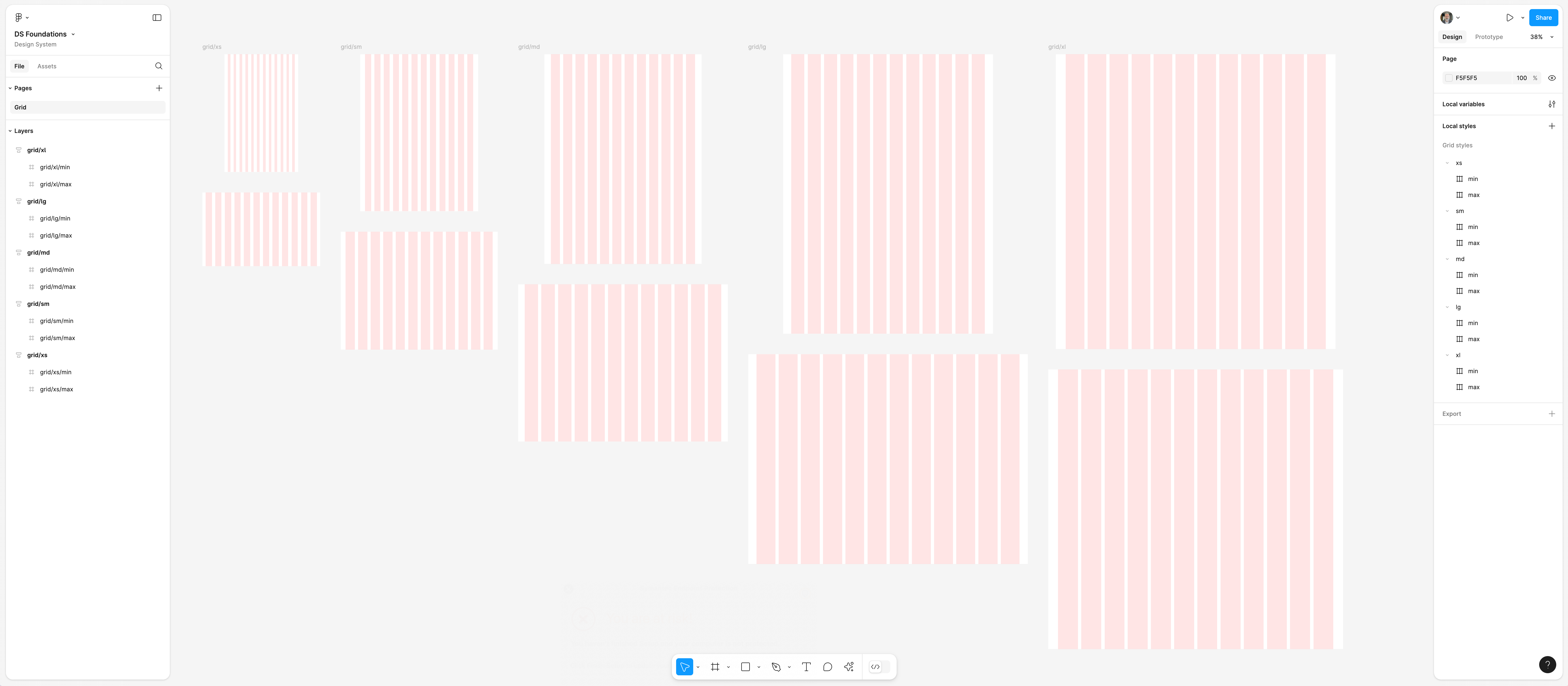
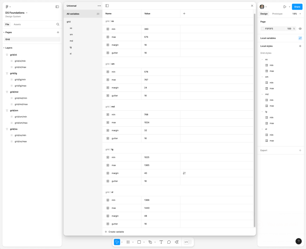
In this article, I’ll recommend the best breakpoints for your website, considering three main categories: mobile devices, tablets, and desktops. Below is a reference table with the minimum and maximum width values for each range, along with the recommended margins and gutters for optimal design:
| Breakpoint | Min Width | Max Width | Margin | Gutter | Column |
|---|---|---|---|---|---|
| xs | 360 | 575 | 16 | 16 | 12 |
| sm | 576 | 767 | 24 | 16 | 12 |
| md | 768 | 1024 | 32 | 16 | 12 |
| lg | 1025 | 1365 | 40 | 16 | 12 |
| xl | 1366 | 1440 | 48 | 16 | 12 |
These values not only ensure a well-structured design but also help maintain visual consistency across a variety of devices, optimizing the user experience.
Breakpoints for Mobile Devices: Extra Small (xs) and Small (sm)
Mobile devices account for the majority of global web traffic, so it is crucial to prioritize responsive design for small screens. The xs and sm breakpoints are essential to ensure that your site is accessible and user-friendly on mobile devices.
- Extra Small (xs): 360px – 575px
This breakpoint covers smaller mobile devices, such as lower-end phones or those with compact screens. It’s important to optimize interactive elements like buttons and menus to make them easily accessible and readable on small screens. - Small (sm): 576px – 767px
This range includes most modern smartphones with larger screens. At this point, you can start working on slightly wider designs and display more content without compromising readability or usability.
What to adjust on mobile?
- Font size and buttons: Ensure that buttons are large enough to be tapped with a finger and text is legible without the need for zooming.
- Image optimization: Use lower-resolution images to reduce load times and improve user experience.
- Vertical layout: Most mobile devices are used in portrait mode, so it’s important that your design works well in this orientation.
Breakpoint for Tablets: Medium (md)
Tablets require an intermediate approach, as their screens are larger than phones but smaller than desktops. The md breakpoint is ideal for these types of devices.
- Medium (md): 768px – 1024px
This range covers most tablets, such as the iPad in portrait mode. It’s a key point to adjust the design and offer a user experience that takes advantage of the larger screen without complicating navigation.
What to adjust on tablets?
- Increase screen space usage: Take advantage of the larger screen to display more content without overloading the interface.
- Usability in landscape mode: Ensure that the site works well in both vertical and horizontal orientations, as users may rotate the device to view content more comfortably.
Breakpoints for Desktops: Large (lg) and Extra Large (xl)
The lg and xl breakpoints are used for larger screens, such as laptops and desktop monitors. Here’s where you can maximize the use of available screen space.
- Large (lg): 1025px – 1365px
This breakpoint is suitable for most laptops. It allows for expanding the design and displaying more content on the screen without the need for excessive scrolling. - Extra Large (xl): 1366px – 1440px
This range covers large desktop screens, such as high-resolution monitors. At this point, it’s important to optimize the layout to take full advantage of the screen space without cluttering the interface.
What to adjust on desktop?
- Column layout: On larger screens, you can use a multi-column structure to present more information simultaneously.
- High-resolution images and graphics: Increase the resolution of images and graphics to take full advantage of high-definition displays.
Conclusion
Using breakpoints such as xs, sm for mobile, md for tablets, and lg and xl for desktops will help you create a responsive design that provides an optimal experience across all platforms. By adjusting margins and gutters as suggested in the table, you can ensure that your website not only looks good but also offers a consistent and smooth user experience across different devices.
Responsive design is not just a trend; it is a necessity in modern web development. By carefully planning your breakpoints and ensuring each device has an optimized experience, your website will be ready to perform well and be accessible to all users.
Figma: https://www.figma.com/community/file/1416212487552660211/grid-system