
In the world of graphic design, choosing the right typographic scale is critical to creating a consistent and engaging user experience. In this article, we will explore the most common typographic scales used in web and mobile applications and how to apply them in design systems.
There are several typographic scales used in web and mobile design, and here are some of the most common ones:
| Typographic Scale | Proportion | Line Height | Main Use | Reason for Use |
|---|---|---|---|---|
| Minor Second | 1.067 (16:15) | 1.2 – 1.4 | Mobile | Achieves a very subtle hierarchy, useful in applications with dense content. |
| Major Second | 1.125 (9:8) | 1.2 – 1.4 | Web Mobile | Flexible and adaptable, easy to adjust for different screen sizes and pixel densities. |
| Minor Third | 1.200 (6:5) | 1.3 – 1.5 | Web | Provides a subtle hierarchy, ideal for smooth transitions between text sizes. |
| Major Third | 1.250 (5:4) | 1.3 – 1.6 | Web | Offers a good balance between readability and visual hierarchy. Facilitates navigation and reading. |
| Perfect Fourth | 1.333 (4:3) | 1.4 – 1.6 | Web | Creates a more pronounced hierarchy, ideal for sites with many levels of headings and subheadings. |
| Augmented Fourth | 1.414 (7:5) | 1.4 – 1.6 | Web Mobile | Provides a gradual increase, useful for designs with a more distinctive visual hierarchy. |
| Perfect Fifth | 1.500 (3:2) | 1.4 – 1.6 | Web | Generates notable contrast between titles and body text, ideal for highlighting sections. |
| Minor Sixth | 1.600 (8:5) | 1.5 – 1.7 | Web | Offers greater visual contrast, useful for designs focused on aesthetics. |
| Golden Ratio | 1.618 | 1.5 – 1.8 | Web (occasionally) | Based on the golden ratio, less common due to the large jumps in font size. |
| Major Sixth | 1.667 (5:3) | 1.5 – 1.8 | Web | Similar to Minor Sixth, provides strong visual contrast. |
| Minor Seventh | 1.778 (16:9) | 1.6 – 1.8 | Web | Used to create a very pronounced visual hierarchy, ideal for visually impactful designs. |
| Major Seventh | 1.875 (15:8) | 1.6 – 1.8 | Web | Produces significant separation between different levels of text. |
| Octave | 2.000 (2:1) | 1.6 – 1.8 | Web | Generates very strong contrast between headings and body text, ideal for highlighting headings. |
The Importance of Typographic Scale on the Web
On the web, typographic scale is essential for guiding the user through content in a clear and coherent manner. Since the web is a visual communication medium, typographic scale helps create a visual hierarchy that makes reading and navigation easier.
The Ideal Typographic Scale for the Web
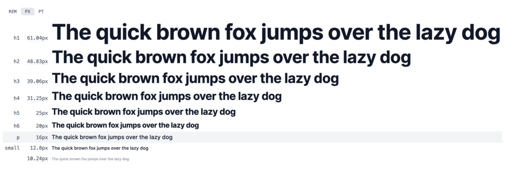
The most commonly used typographic scale on the web is the Major Third (1.250), as it provides a good balance between readability and visual hierarchy. This scale is based on the 5:4 ratio, resulting in a gradual and harmonious increase in font sizes.
Applying Typographic Scale on the Web
To apply typographic scale on the web, it’s important to consider visual hierarchy and readability. Use font sizes that scale logically and predictably, and adjust the scale as needed to accommodate different screen sizes and pixel densities.
The Major Third is popular on the web because:
- It provides a good balance between readability and visual hierarchy: The Major Third allows for creating a clear and consistent visual hierarchy, making reading and navigation easier on the web.
- It is flexible and adaptable: The Major Third can be easily adjusted to fit different screen sizes and pixel densities.
- It is compatible with web design guidelines: The Major Third aligns with the web design guidelines of major platforms, such as Google’s Material Design and Apple’s Human Interface Guidelines.
Here’s an example of how the Major Third would look on the web:
Remember that the choice of typographic scale depends on the design and user experience you want to achieve on the web.
The Importance of Typographic Scale in Mobile Applications
In mobile applications, typographic scale is crucial for creating an intuitive and appealing user experience. Since mobile screens are smaller than web screens, the typographic scale must be carefully chosen to ensure readability and usability.
The Ideal Typographic Scale for Mobile Applications
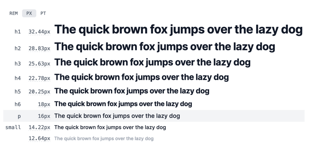
The most commonly used typographic scale in mobile applications is the Major Second (1.125), as it provides a good balance between readability and visual hierarchy on small screens. This scale is based on the 9:8 ratio, resulting in a gradual and harmonious increase in font sizes.
Applying Typographic Scale in Mobile Applications
To apply typographic scale in mobile applications, it’s important to consider readability and usability. Use font sizes that scale logically and predictably, and adjust the scale as needed to accommodate different screen sizes and pixel densities.
The Major Second is popular in mobile applications because:
- It provides a good balance between readability and visual hierarchy on small screens: The Major Second allows for creating a clear and consistent visual hierarchy on small screens, making reading and navigation easier in mobile applications.
- It is flexible and adaptable: The Major Second can be easily adjusted to fit different screen sizes and pixel densities.
- It is compatible with mobile design guidelines: The Major Second aligns with the mobile design guidelines of major platforms, such as Google’s Material Design and Apple’s Human Interface Guidelines.
Here’s an example of how the Major Second would look in mobile applications:
Remember that the choice of typographic scale depends on the design and user experience you want to achieve in the mobile application.
The Line Height in the Typographic Scale
Implementing a good line-height (or leading) for typographic scales involves balancing readability, visual hierarchy, and the overall aesthetic of your design. Here are some best practices to consider when setting line-height for different typographic scales:
General guidelines for Line Height
- Body Text: The line-height for body text should typically be between 1.4 and 1.6 times the font size. This range provides enough space between lines for readability, especially for longer passages of text.
- Headings: Headings generally require less line-height compared to body text, typically around 1.2 to 1.4 times the font size. This tighter spacing helps to visually group the heading with its related content.
Line Height adjusted to screen size
- Mobile: On smaller screens, reduce the line height slightly (e.g., 1.2 – 1.4 for body text) to accommodate limited vertical space while ensuring legibility.
- Desktop: You can afford to use slightly higher line heights on larger screens (e.g., 1.4 – 1.6 for body text) to create a more open and airy feel.
The Line Height context matters
- Dense Content: For text-heavy designs, like articles or reports, opt for a larger line-height within the recommended range to avoid visual clutter.
- Minimalist Designs: In minimalist or highly visual designs, you might opt for a tighter line-height to maintain a clean and compact appearance.
Accessibility considerations for the Line Height
Ensure that your line-height choices do not compromise accessibility. Text should be easy to read, especially for users with visual impairments. WCAG guidelines recommend a line-height of at least 1.5 times the font size for body text.
Test and iterate the Line Height
Always test your typographic settings across different devices and screen sizes. What works well on a desktop might need adjustment on a mobile device or a different browser.
Conclusion
Choosing the right typographic scale is crucial for creating a consistent and appealing user experience on the web and mobile applications. By understanding the most commonly used typographic scales in each medium, you can create design systems that guide the user through the content in a clear and coherent manner.